stripe.com
open ↗
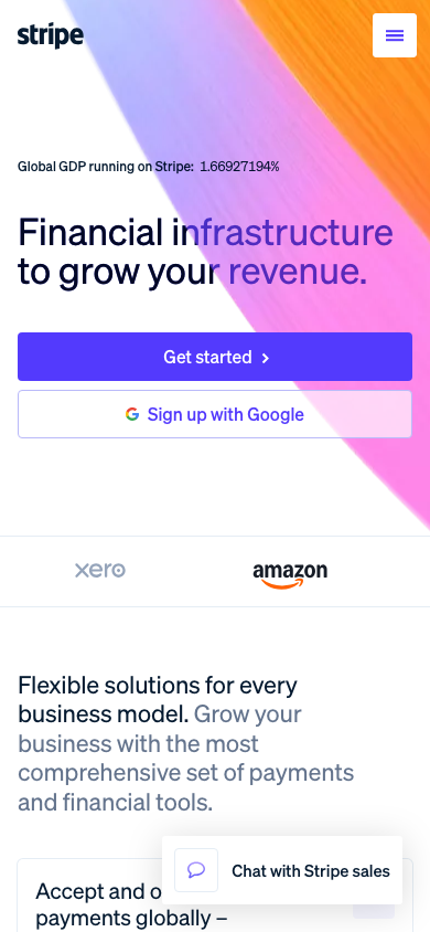
Live reference
Preview — our components × captured values
Style Guide preset (skin)
- Heading font
- sohne-var → Google: Inter
- Body font
- sohne-var → Google: Inter
- Heading line-height
- 1.15
- Mobile h1
- 48px → 34px
- Mobile overflow
- none
- Base size
- 16px
- Type scale
- not detected
- Rounding
- Slightly rounded (4px)
- Line width
- not detected
- Button hover
- swap background
- Text-over-image halo
- not detected
- Heading tracking
- not detected
- Label tracking
- not detected
- Focus ring
- not detected
- Easing
- not detected
- Container max
- 1248px
- Section padding
- 80px
- Accent gradient
- not detected
- Icon stroke
- not detected
- Spacing unit
- not detected
- Transition
- 300ms
- Link underline
- false
- Button
- not detected
rendered (getComputedStyle on laid-out page) — higher fidelity than the regex engine
Contact form — how the fields render
- Captured from
- stripe.com/au/contact/sales (inner page)
- Fields
- 17 · multi-column
- Field border
- 0px none #0a2540
- Field radius
- 4px
- Field height
- 36px
- Field padding
- 5px 12px 7px 12px
- Field font
- sohne-var 15px
- Field shadow
- not detected
- Focus state
- shadow (3px #0a2540)
- Label
- 300 16px
- Submit
- "Submit" · #000000 · radius 16.5px
Captured form-field facts. These feed the contact-form component — see the field-token proposal in docs/contact-form-component.md.
Capture audit — what's real vs default
12 of 27 values captured from this site. The rest fall back to library defaults — shown so nothing hardcoded can pass as captured.
- Brand primarycaptured: #533afd
- Secondary colourdefault
- Page backgroundcaptured: #000000
- Text colourdefault
- Text colour (inverse)default
- Heading colourdefault
- Link colourdefault
- Link colour (inverse)default
- Heading fontcaptured: sohne-var
- Body fontcaptured: sohne-var
- Heading size (H1)default
- Heading weightcaptured: 300
- Heading trackingdefault
- Primary button bgcaptured: #533afd
- Primary button radiuscaptured: 4
- Roundingcaptured: 4px
- Line / border widthdefault
- Button hoverdefault
- Focus ringdefault
- Easingdefault
- Transition speedcaptured: 300ms
- Container max-widthcaptured: 1248px
- Section paddingcaptured: 80px
- Accent gradientdefault
- Image treatmentcaptured: captured
- Text-over-image halodefault
- Icon strokedefault
- Alt background (derived from page)library default
- Card paddinglibrary default
- Small/large shadow scalelibrary default
- Secondary-button outline stylelibrary default
Inventory (raw evidence)
Character & component map
- Shadow usage
- heavy
- Border usage
- heavy
- Gradients
- present
- Uppercase labels
- occasional
- Letter-spacing
- yes
- navobserved
- heroobserved
- buttonsobserved
- cardobserved
- pricingobserved
- testimonialobserved
- feature-gridobserved
- galleryGAP
- accordion-faqGAP
- tabsobserved
- tableobserved
- formobserved
- footerobserved
- dropdownGAP
Worth considering — seen here, not yet captured
Notable styling present in this site's CSS that the tool doesn't yet turn into a captured value — candidates for future capture. Full coverage & roadmap →
- will-change (perf)38×
- object-fit25×
- filter (blur etc.)14×
- scroll-snap14×
- container queries12×
- CSS mask10×
- mix-blend-mode7×
- conic-gradient5×
- sticky positioning5×
- scroll-behavior5×
Beyond the capture — Claude's read & generative proposals
The character CSS mining can't reach — bespoke anatomy, motifs, the "feel". These are my interpretations and generative suggestions. They are NOT applied to the reconstruction above — they're ideas to react to when this becomes a library's seed.
Stripe's identity is almost entirely in things CSS mining can't see: a famous animated multi-hue gradient ribbon as the hero canvas, depth carried by big soft diffuse shadows (not borders), very generous whitespace, and a tight confident grotesque. The palette teardown caught the navy and violet, but the *feel* is gradient + float + air. Restrained and premium, aimed at developers.
-
Animated gradient ribbon as the hero canvas
observed The signature: a skewed, slowly-animating multi-colour gradient mesh sits behind the hero and section dividers. It's generated in JS/canvas, so mining only saw the flat fallback colours.
proposal A decorative `.c-hero--gradient` variant + a `--gradient-accent` token (an angled multi-stop gradient derived from brand-primary → accent → secondary). Static by default; an optional CSS-only animated variant. This single move would carry most of the 'Stripe feeling'.
-
Depth via big soft diffuse shadows, not borders
observed Cards float on large, low-opacity, slightly brand-tinted shadows (e.g. 0 30px 60px -10px rgba(50,50,93,.25)) rather than sitting in hairline borders. The shadow IS the elevation language.
proposal Make this library's `.c-card` default to a `--shadow` scale of large tinted diffuse shadows (tinted with brand-primary) and drop the border. A `.c-card--float` if we want it optional. This is a deliberate library-character choice the Style Guide can't express.
-
Gradient text on key headings
observed Hero/section headlines occasionally use a clipped gradient fill rather than a solid colour — a small but recognisable flourish.
proposal A `.c-heading--gradient` utility (background-clip:text) reading the same `--gradient-accent`. Use sparingly — propose it as an opt-in display treatment, not the default heading.
-
Generous, almost luxurious whitespace + tight type
observed Section padding is large and confident; type is tightly tracked and sized with restraint. The composition breathes — density is low, hierarchy is clear.
proposal Set this library's `--spacing-section` generous and the heading tracking tight as baked-in defaults (independent of the Style Guide's spacing unit). The 'air' is a library trait, not a token a client would set.
-
Duotone product icons in tinted tiles
observed Feature/product icons are simple two-tone line glyphs sitting in soft rounded tiles tinted with the brand — consistent, calm, never decorative emoji.
proposal Give this library's `.c-feature__icon` a duotone treatment (brand-primary line + accent fill) and a softly-tinted tile. A defined icon style is part of a library's character; propose a small starter icon set.
-
Code/snippet blocks as a first-class motif
observed Being developer-facing, monospaced code cards with subtle syntax tinting appear as a recurring design element.
proposal A `code-block` component (currently not in our spec) — propose adding it to the spec as a GAP for this library, since it's core to this audience. Flagging, not building.
Read by Claude · 2026-06-03. Tell me which proposals to pursue.