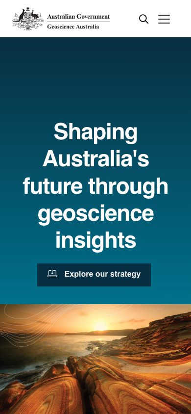
Quick look above; the showcases render the full Slipstream bank with sample data. Captured values only on A-side — anatomy stays ours until we craft a library.
Style Guide preset (skin)
primary
#082e41
pri-accent
#00718b
secondary
—
sec-accent
—
Surfaces — page · alt · emphasis · inverse
page
#000000
alt
—
emphasis
—
inverse
#ffffff
btn hover
#062534
Heading font
Helvetica → Google: Inter
Body font
Helvetica → Google: Inter
Heading line-height
1.2
Mobile h1
64px → 46px ⚠ big
Mobile overflow
none
Base size
17px
Type scale
not detected
Rounding
Sharp (0px)
Line width
not detected
Button hover
subtle / none
Text-over-image halo
not detected
Heading tracking
not detected
Label tracking
not detected
Focus ring
not detected
Easing
not detected
Container max
1184px
Section padding
96px
Accent gradient
not detected
Icon stroke
not detected
Spacing unit
not detected
Transition
not detected
Link underline
false
Button
not detected
rendered (getComputedStyle on laid-out page) — higher fidelity than the regex engine
Capture audit — what's real vs default
12 of 27 values captured from this site. The rest fall back to library defaults — shown so nothing hardcoded can pass as captured.
Brand primarycaptured: #082e41
Secondary colourdefault
Page backgroundcaptured: #000000
Text colourdefault
Text colour (inverse)default
Heading colourdefault
Link colourdefault
Link colour (inverse)default
Heading fontcaptured: Helvetica
Body fontcaptured: Helvetica
Heading size (H1)captured: 42px
Heading weightcaptured: 700
Heading trackingdefault
Primary button bgcaptured: #082e41
Primary button radiuscaptured: 0
Roundingcaptured: 0px
Line / border widthdefault
Button hoverdefault
Focus ringdefault
Easingdefault
Transition speeddefault
Container max-widthcaptured: 1184px
Section paddingcaptured: 96px
Accent gradientdefault
Image treatmentcaptured: captured
Text-over-image halodefault
Icon strokedefault
Alt background (derived from page)library default
Card paddinglibrary default
Small/large shadow scalelibrary default
Secondary-button outline stylelibrary default
Inventory (raw evidence)
Palette by frequency
#000000 ·41
#082e41 ·22
#ffffff ·12
#00718b ·4
#606f74 ·4
#cccccc ·4
#888888 ·3
#1e1e1e ·3
#773775 ·2
#637c6b ·2
#0b5e4b ·2
#cb6c37 ·2
#b43b3b ·2
#2f2f2f ·2
#ff5268 ·2
#ff0000 ·2
#005a6f ·1
#062534 ·1
Radii
0px2px3px4px5px10pxpill
Shadow samples
inset 0 0 6px rgba(0, 0, 0, .3)
none !important
0 0 0 1px var(--primaryteal-dark)
0 0 0 1px var(--interactionRed)
0 0 0 1px var(--primaryteal-dark)
Character & component map
Shadow usage
moderate
Border usage
moderate
Gradients
present
Uppercase labels
occasional
Letter-spacing
yes
Components observed vs gaps (gaps left empty — never auto-filled)
navobserved
heroobserved
buttonsobserved
cardobserved
pricingGAP
testimonialobserved
feature-gridobserved
galleryobserved
accordion-faqGAP
tabsGAP
tableGAP
formobserved
footerobserved
dropdownGAP
Worth considering — seen here, not yet captured
Notable styling present in this site's CSS that the tool doesn't yet turn into a captured value — candidates for future capture. Full coverage & roadmap →
object-fit9×
filter (blur etc.)3×
mix-blend-mode2×
sticky positioning1×
will-change (perf)1×
Beyond the capture — Claude's read & generative proposals
The character CSS mining can't reach — bespoke anatomy, motifs, the "feel". These are my interpretations and generative suggestions. They are NOT applied to the reconstruction above — they're ideas to react to when this becomes a library's seed.
Not reviewed yet. Ask Claude in chat to “read this teardown” and I'll add observations + generative proposals here.